The menus and toolbars of Tiny EditLive! are completely customizable through configuration files. This article explains how the EditLive! toolbars and menu bars may be configured and how the configuration of the menu bar and toolbars affects the functionality of EditLive!.
The Menu Bar
The menu bar in EditLive! can have any number of individual menus added to it. The names of the menus added to the menu bar are completely customizable. Furthermore, the specification of a mnemonic for the menu is also customizable. To specify the mnemonic for a menu, an escaped ampersand (&) must be specified in the name attribute of the relevant <menu> element in the XML configuration file.
Example
This would specify a View menu which has the mnemonic of V:
<editLive>
...
<menuBar>
...
<menu name="&View">
...
</menu>
...
</menuBar>
...
</editLive>
Tiny also provides 8 default menu names. These default menu names are automatically internationalized to match the user's locale.
- ephox_filemenu - The internationalized File menu.
- ephox_editmenu - The internationalized Edit menu.
- ephox_viewmenu - The internationalized View menu.
- ephox_insertmenu - The internationalized Insert menu.
- ephox_formatmenu - The internationalized Format menu.
- ephox_toolsmenu - The internationalized Tools menu.
- ephox_tablemenu - The internationalized Table menu.
- ephox_formmenu - The internationalized Forms menu.
Example
The following configuration file example will display a View menu item in whatever native language the user's local machine is using.
<editLive>
   ...
   <menuBar>
      ...
      <menu name="ephox_viewmenu">
         ...
      </menu>
      ...
   </menuBar>
   ...
</editLive>
Menu Items
EditLive! menu items are specified using the name attribute of a <menuItem> configuration file element. Any number of <menuItem> elements can be nested within a <menu> configuration file element. For a comprehensive list of all available menu items see the Menu and Toolbar Item List.
Example
The following configuration file example would create an Open menu item within a File menu.
<editLive>
   ...
   <menuBar>
      ...
      <menu name="ephox_filemenu">
         ...
         <menuItem name="Open"/>
         ...
      </menu>
      ...
   </menuBar>
   ...
</editLive>
Menu Item Groups
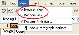
Some menu items are added to the applet's interface in a group. These groups of menu items within EditLive! are specified through the use of a <menuItemGroup> configuration file element. The name attribute of the <menuItemGroup> element determines which menu item group is inserted. EditLive! comes with a collection of predefined interface item groups which may be placed in the menus and toolbars. Menu item groups will have default menu item text associated with them. They may also have default mnemonics, images, and shortcuts. For more information on what menu item groups are available for use, please see the Menu and Toolbar Item List article. The activation of menu items in menu item groups is mutually exclusive; for example, the Browser View item cannot be activated at the same time as the Window View item.
Example
The following configuration file example would add the Browser View and Window View items to the View menu.
 <editLive>
   ...
   <menuBar>
      ...
      <menu name="ephox_viewmenu">
         ...
         <menuItemGroup name="FrameView"/>
         ...
      </menu>
      ...
   </menuBar>
   ...
</editLive>

Menu Separators
Menu separators are horizontal lines spanning the width of the menu which can be used to visually break a menu into its constituent parts and areas. These are added through the use of the <menuSeparator> configuration file element, within a <menu> element. They serve no purpose other than that of a visual aid.
Toolbars
The EditLive! applet can be instantiated with multiple toolbars. The <toolbar> element is used to specify a toolbar within the EditLive! configuration file. Toolbars will appear within EditLive in the order in which they are listed within the configuration file. When specifying a toolbar with the <toolbar> element, the toolbar must be given a unique name via the name attribute. The value of the name attribute does not appear in the EditLive! user interface.
Example
The following configuration file example would specify a new toolbar with the name format:
 <editLive>
   ...
   <toolbars>
      ...
      <toolbar name="format">
         ...
      </toolbar>
      ...
   </toolbars>
   ...
</editLive>
Each toolbar can have a variety of buttons, button groups, and drop-down combo boxes added to it. Toolbar buttons are added via the <toolbarButton> element, toolbar button groups through the <toolbarButtonGroup> element, and combo boxes through the <toolbarComboBox> element.
Toolbar Buttons
Toolbar buttons in EditLive! are specified through the use of a <toolbarButton> configuration file element. The name attribute of the <toolbarButton> element determines which toolbar button is inserted. EditLive! comes with a collection of predefined interface items which may be placed on the EditLive! toolbars, menus, or shortcut menu. Items from the Menu and Toolbar Item List will have default tool tip text associated with them. Most also have default images; however, some of the items may not have images associated with them. It is recommended that interface commands without associated images are not placed on the toolbars. For more information on what interface commands are available for use please see the Menu and Toolbar Item List article.
Example
The following configuration file example would add the New, Open..., Save and Save As... items to a toolbar with the name command:
 <editLive>
   ...
   <toolbars>
      ...
      <toolbar name="command">
         <toolbarButton name="New"/>
         <toolbarButton name="Open"/>
         <toolbarButton name="Save"/>
         <toolbarButton name="SaveAs"/>
      </toolbar>
      ...
   </toolbars>
  ...
</editLive>
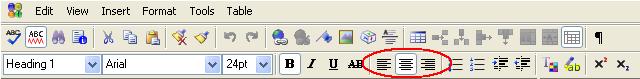
Toolbar Button Groups
Some toolbar buttons are added to the applet's interface in a group. These groups of toolbar buttons within EditLive! are specified through the use of a <toolbarButtonGroup> configuration file element. The name attribute of the <toolbarButtonGroup> element determines which toolbar button group is inserted. EditLive! comes with a collection of predefined interface item groups which may be placed on the menus and toolbars. Items from the interface command collection will have default tool tip text associated with them. Most also have default images; however, some of the items may not have images associated with them. It is recommended that interface item groups without associated images are not placed on the interface. For more information on what interface commands are available for use please see the EditLive! for Java Menu and Toolbar Item List article.
Example
The following configuration file example would add the Align Left, Align Center and Align Right buttons from the alignment button group to the toolbar named command.
 <editLive>
   ...
   <toolbars>
      ...
      <toolbar name="command">
         <toolbarButtonGroup name="Align"/>
      </toolbar>
      ...
   </toolbars>
   ...
</editLive>

Toolbar Combo Boxes
Combo boxes for the style, font typeface, and font size text attributes can be added to the EditLive! toolbar through the use of a <toolbarComboBox> configuration file element with a specific value for the name attribute. Each toolbar combo box has a specific value for the name attribute associated with it. Furthermore, the items listed in each of these combo boxes can be specified by the developer through the inclusion of <comboBoxItem> child elements in a <toolbarComboBox> element.
Example
The following configuration file example would create the Style drop down combo box in the EditLive! for Java Format Toolbar with the listing of Normal, Heading 1, Heading 2, and Heading 3 items which represent the <P>, <H1>, <H2>, and <H3> styles respectively:
 <editLive>
   ...
   <toolbars>
      ...
      <toolbar name="format">
         ...
         <toolbarComboBox name="Style">
            <comboBoxItem name="P" text="Normal" />
            <comboBoxItem name="H1" text="Heading 1" />
            <comboBoxItem name="H2" text="Heading 2" />
            <comboBoxItem name="H3" text="Heading 3" />
         </toolbarComboBox>
         ...
      </toolbar>
      ...
   </toolbars>
   ...
</editLive>
The toolbar combo boxes available for use with EditLive!, their corresponding functions, and their associated values for the <toolbarComboBox> name attribute are listed in the Toolbar Combo Box Items section of the Menu and Toolbar Item List.
Toolbar Separators
Toolbar separators are vertical lines spanning the height of the toolbar that visually break a toolbar into its constituent parts and areas. These are added through the use of the <toolbarSeparator> configuration file element within a <toolbar> element. They serve no purpose other than that of a visual aid.
Inline Toolbars
EditLive! provides support for a select set of toolbars which hover above specific HTML elements. Inline toolbars are specified via <inlineToolbar> configuration elements, which are nested under the <inlineToolbars> configuration element.
The name attribute for an <inlineToolbar> element specifies which element the toolbar will hover above. Consult the <inlineToolbar> documentation for a list of the currently supported name attribute values.
<inlineToolbar> elements support child <toolbarButton> and <toolbarSeparator> configuration elements to display inline toolbar buttons and separators.
Example
The following configuration file example creates an inline toolbar that hovers over TABLE elements. This toolbar features the Insert Table Row and Insert Table Column toolbar buttons.
 <editLive>
   ...
      <inlineToolbars>
         <inlineToolbar name="table">
            <toolbarButton name="InsRow"/>
            <toolbarButton name="InsCol"/>
               </inlineToolbar>
      </inlineToolbars>
   ...
</editLive>
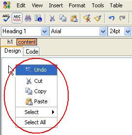
The Shortcut (Context) Menu
Shortcut menu items in EditLive! are specified through the use of a <shrtMenuItem> configuration file element, with a specific value for the name attribute associated with it. Any of the name attributes applicable to <menuItem> and <toolbarButton> configuration file elements can be used in the shortcut menu.
Example
The following configuration file example would add the Cut, Copy and Paste items to the Shortcut menu:
 <editLive>
   ...
   <shortcutMenu>
      <shrtMenu>
         <shrtMenuItem name="Cut"/>
         <shrtMenuItem name="Copy"/>
         <shrtMenuItem name="Paste"/>
      </shrtMenu>
   </shortcutMenu>
   ...
</editLive>

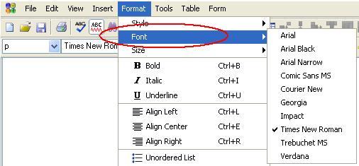
Submenus
Submenus can be added to the EditLive! menu bar and shortcut menu. These are added through the use of the <submenu> configuration file element with a specific value for the name attribute.
If a <submenu> element is left empty, each of the submenus added will contain the same items as the corresponding item on the EditLive! toolbar. If the corresponding item does not exist on the toolbar then the submenu will appear empty. If the developer wishes to make the submenu items distinct from the toolbar items, the <submenu> element may have <menuItem> child elements added to it.
Once menu items are specified within a submenu then the contents of the submenu will no longer mirror the corresponding toolbar element.
Example
The following configuration file example would add the Font Face submenu to the Format menu with items on the submenu corresponding to the items specified in the Font Face drop down combo box of the EditLive! toolbar:
 <editLive>
   ...
   <menuBar>
      ...
      <menu name="ephox_formatmenu">
         ...
         <submenu name="Face"/>
         ...
      </menu>
      ...
   </menuBar>
   ...
</editLive>

Example
The following configuration file example would add the Style submenu to the Shortcut menu with items on the submenu corresponding to the items specified in the Font drop down combo box of the EditLive! toolbar:
 <editLive>
   ...
   <shortcutMenu>
      <shrtMenu>
         ...
         <submenu name="Style" />
         ...
      </shrtMenu>
   </shortcutMenu>
   ...
</editLive>
Example
The following configuration file example would add the Style submenu to the Format menu. The menu created would contain the Normal and Heading 1 Styles which, respectively, correspond to the <P> and <H1> styles. Note that this submenu would NOT contain the values from the corresponding toolbar item.
 <editLive>
   ...
   <menuBar>
      ...
      <menu name="ephox_formatmenu">
         ...
         <submenu name="Style">
            <menuItem name="P" text="Normal" />
            <menuItem name="H1" text="Heading 1" />
         </submenu>
         ...
      </menu>
      ...
   </menuBar>
   ...
</editLive>
Example
The following configuration file example would a customized Color submenu to the Format menu. The color submenu would contain the colors red, blue, and yellow.
 <editLive>
   ...
   <menuBar>
      ...
      <menu name="ephox_formatmenu">
         ...
         <submenu name="Color">
            <menuItem name="#FF0000" text="Red" />
            <menuItem name="#0000FF" text="Blue" />
            <menuItem name="#FFFF00" text="Yellow" />
         </submenu>
         ...
      </menu>
      ...
   </menuBar>
   ...
</editLive>
The submenus available for use with EditLive!, their corresponding toolbar items, mnemonics, and associated values for the <submenu> name attribute are listed in the Menu and Toolbar Item List.
Customizing Available Items
The interface items available through the standard EditLive! interface command collection can be customized to allow the associated text, mnemonic, and image to be altered. These customizations can be performed on menu and toolbar items by setting the text, imageURL and mnemonic attributes of the <menuItem> and <shrtMenuItem>configuration file elements, and the text and imageURL attributes of the <toolbarButton> element.
Example
The following example customizes the New menu item to use the text Create New, the image customImage.gif and the mnemonic c.
<editLive>
...
<menuBar>
...
<menu name="&File">
<menuItem name="New" text="Create New" imageURL="customImage.gif" mnemonic="c" />
...
</menu>
...
</menuBar>
...
</editLive>
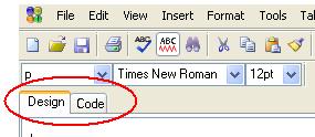
Tab Views
EditLive! can be configured to use a tabbed view which allows users to more intuitively switch between different views. These tabs can be placed on the top or bottom of the EditLive! editing area, or they can be removed completely. The configuration of the tabbed view for EditLive! is achieved via the tabPlacement attribute of the <wysiwygEditor> configuration file element.
Example
For the following configuration file example, the views tab would appear at the top of the EditLive! editing pane.
 <editLive>
   ...
   <wysiwygEditor tabPlacement="top">
      ...
   </wysiwygEditor>
   ...
</editLive>

Removing the Toolbars
Either of the toolbars of EditLive! may be removed. In order to display EditLive! without any toolbars, ensure that there are no <toolbar> elements within the configuration file.
Limiting the Functionality of EditLive!
Removing specific functionality from EditLive! is achieved by removing the corresponding menu and/or toolbar buttons from the EditLive! interface. When the item is not included in the configuration file then the item will not appear on the menu or toolbar and, in most cases, the shortcut key for the item will be disabled.
The shortcut keys for the Cut, Copy, Paste, Bold, Italic and Underline actions will always be enabled. This is independent of the associated menu items and toolbar buttons. Thus, the shortcut keys for these functions will still be functional even if the associated menu items or toolbar buttons are removed.
See Also
Attachments:
 menuitemgroup.jpg (image/jpeg)
 menuitemgroup.jpg (image/jpeg)
menuitemgroup.jpg (image/jpeg)
menuitemgroup.jpg (image/jpeg)
 toolbarbuttongroup.jpg (image/jpeg)
 toolbarbuttongroup.jpg (image/jpeg)
toolbarbuttongroup.jpg (image/jpeg)
toolbarbuttongroup.jpg (image/jpeg)
 shortcutmenu.jpg (image/jpeg)
 shortcutmenu.jpg (image/jpeg)
shortcutmenu.jpg (image/jpeg)
shortcutmenu.jpg (image/jpeg)
 submenu.jpg (image/jpeg)
 submenu.jpg (image/jpeg)
 submenu.jpg (image/jpeg)
tabview.jpg (image/jpeg)
submenu.jpg (image/jpeg)
tabview.jpg (image/jpeg)
 tabview.jpg (image/jpeg)
 tabview.jpg (image/jpeg)